Minim (palaeography)


In palaeography, a minim is a short, vertical stroke used in handwriting. The word is derived from the Latin minimum, meaning least or smallest.
A minim is the basic stroke for the letters i, m, n, and u in uncial script and later scripts deriving from it. Parts of other letters are based on minims as well: when a minim is extended above the line, it becomes an ascender, as in the letters d and b, and when it is extended below the line, it becomes a descender, as in the letters p and q. It is a stem when it forms only part of a letter, such as r.
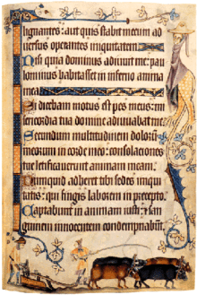
Minims often have a connecting stroke which makes it clear that they form an m, n, etc.; however, in Gothic scripts, also known as textualis especially in late examples, minims may connect to each other with only a hair line stroke making it difficult for modern readers to tell what letter is meant. A 13th-century example of this is: mimi numinum niuium minimi munium nimium uini muniminum imminui uiui minimum uolunt ("the smallest mimes of the gods of snow do not wish at all in their life that the great duty of the defences of the wine be diminished").[1] In Gothic script this would look almost like a series of single strokes (this problem eventually led to a dotted ⟨i⟩ and separate letters ⟨j⟩ and ⟨v⟩).[2]
Middle English scribes adopted a practice of replacing ⟨u⟩ before ⟨m⟩, ⟨n⟩, or ⟨v⟩ with ⟨o⟩ in order to break up the sequence of minims. The resulting spellings have persisted into modern times in words such as come, honey, and love, where an o stands for a short ŭ. This is the reason Richard Coates gave, in his 1998 article, for 'LOndon' changing its spelling from LUnden.[3][4]
Gothic minims may have various decorations (essentially serifs), from a simple initial headstroke, to large diamond-shaped finials at the top and bottom, such as in textualis quadrata, the most decorated form of Gothic. Textualis sine pedibus, literally "textualis without feet", has minims with no finials at all, while textualis rotunda has round finials.
References[edit]
- ^ "Medieval Minims | History Today". www.historytoday.com. Retrieved 2022-03-11.
- ^ Meyer, Wilhelm (1897). "Die Buchstaben-Verbindungen der sogenannten gothischen Schrift". Abhandlungen der königlichen Gesellschaft der Wissenschaft zu Göttingen, Philologisch-Historische Klasse. Neue Folge. I (6): 97.
- ^ Harley, Heidi (2003). A Linguistic Introduction to English Words (PDF). Blackwell. p. 293.
- ^ Crystal, David (2012). Spell It Out: The Singular Story of English Spelling. Profile Books. pp. 107–8.
