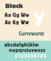
Berthold Block
 | |
| Category | Sans-serif |
|---|---|
| Designer(s) | Hermann Hoffmann |
| Foundry | H. Berthold |
| Date created | 1908 |
Berthold Block is a sans-serif typeface released by the H. Berthold foundry in the early twentieth century and intended for display use.[1] Block has a chunky design suitable for headings, with short descenders allowing tight linespacing and rounded corners.[2][3] It is sometimes simply called "Block". Font design expert Stephen Coles describes it as "a soft but substantial display face with compact dimensions and an organic appearance…[it] isn’t meant for body copy."[4] The Klingspor Museum credits it to Hermann Hoffmann, who managed type design for Berthold.[5][6]
The original metal type release of Block was intentionally "distressed" in style, matching the effect of worn type; some re-releases have a cleaner design. Ferdinand Ulrich suggests that this was to match the organic feel of advertising lettering of the time, including the work of Lucian Bernhard.[7] Block was one of Berthold's most popular typefaces, and was released in a wide range of versions, including lighter weights and type in wood (for large sizes).[8] Metal type versions had stylistic alternate characters such as a more compact 'S' to allow fine-tuning of appearance of type and fit the desired number of characters into a line.[9]
History
[edit]
Berthold Block was released in 1908; Berthold later added additional weights and styles, also releasing phototypesetting versions.[10][11] Berthold also used the name "Block" for a number of other typefaces not particularly closely related to it as a brand extension marketing strategy. These included the script font "Block-Signal" and the blackletter Block-Fraktur.[1]
Block continued to be popular in the phototypesetting period; Jens Gehlhaar comments that "with roughened outlines and in bold weights, it was never a candidate for timelessness, but its big x-height and tight fit made it quite popular in 1970s Germany and England."[12] It was often used by Praktiker and by the Whitechapel Art Gallery for branding in the 1970s and 80s.[13][14] In the late 1970s, Berthold re-released three lighter-weight fonts derived from the Block design as a mini-family named "Berliner Grotesk" for phototypesetting, with the font redraw carried out by Erik Spiekermann.[7][15][a]
Digitisations
[edit]
A variety of digitisations of Block exist, including by Berthold and successor companies and by Bitstream (the condensed weight only).[16][17][18] Paratype of Moscow released an expansion with Cyrillic characters in 1997.[2] Matthew Butterick's Hermes, first released by Font Bureau and later self-released, is a loose adaptation also inspired by other German grotesque typefaces of the period, adding lighter weights and unicase features.[19][20]
References
[edit]- ^ a b "Block - Fonts in Use". Fonts In Use. Retrieved 12 June 2016.
- ^ a b Safayev, Tagir. "Paratype Bloc". Paratype. Retrieved 12 June 2016.
- ^ "Block Berthold". Typewolf. Retrieved 12 June 2016.
- ^ Coles, Stephen (4 June 2015). "In Pieces website". Fonts In Use. Retrieved 12 June 2016.
- ^ "H. Berthold AG" (PDF). Klingspor Museum. Retrieved 12 June 2016.
- ^ Devroye, Luc. "Hermann Hoffmann". Type Design Information. Retrieved 12 June 2016.
- ^ a b c Ulrich, Ferdinand. "From Condensed Light to Extended Ultra". FontShop. Retrieved 19 August 2017.
- ^ "Block in Stahl-Typen". Flickr. 21 February 2012. Retrieved 17 December 2016.
- ^ Coles, Stephen; Hardwig, Florian (21 August 2008). "Berthold Block & Berliner Grotesk, 1921 Specimen". Flickr. Retrieved 17 December 2016.
- ^ "Schriftdesigner Hermann Hoffmann" (PDF). Klingspor Museum. Retrieved 12 June 2016.
- ^ "Berthold BQ". Berthold Types. Retrieved 12 June 2016.
- ^ Gehlhaar, Jens. "Neuwelt: An optimistic transatlantic sans serif type family — Jens Gehlhaar". Jens Gehlhaar. Retrieved 15 December 2021.
- ^ O'Connell, Steve (6 January 2016). "Whitechapel Art Gallery". Fonts In Use. Retrieved 12 June 2016.
- ^ Hardwig, Florian (11 July 2013). "Praktiker". Fonts In Use. Retrieved 12 June 2016.
- ^ a b "Berliner Grotesk BQ". MyFonts. Retrieved 21 August 2017.
- ^ "Block Berthold BE". MyFonts. H. Berthold. Retrieved 12 June 2016.
- ^ Ruecha, Stawix. "Amsi Pro (Block digitisation)". MyFonts. Stawix. Retrieved 12 June 2016.
- ^ "Condensed Gothic 821". MyFonts. Bitstream. Retrieved 12 June 2016.
- ^ Butterick, Matthew. "Hermes Maia ‹ MB Type". MB Type. Retrieved 15 December 2021.
- ^ Butterick, Matthew. "Hermes FB". Font Bureau. Retrieved 12 June 2016.
External links
[edit]- 1921 Berthold Block specimen (digitisation: Stephen Coles)
- Fonts In Use
